From Concept to Clicks:
The SkyGlobal Web UI/UX Case Study
Duration
3 Months
Softwares


The Story Behind
📋SkyGlobal’s website is an e-commerce platform based in Muscat, Oman, that provides a wide selection of construction materials. The platform serves both residential and commercial construction needs, offering items ranging from basic materials like concrete and lumber to more specialised building tools. SkyGlobal is committed to delivering quality and reliability at every stage of the construction process — empowering builders, contractors, and homeowners with dependable support from planning to completion.
Trusted by more than 250 customers
Offers over 300 products
Business goal
📕Sky Global’s business goals can be categorised into four main areas, each of which I have interpreted from a UX perspective.
Design Process
To enhance the UX process, I applied the Design Thinking methodology — focusing on user needs, iterative prototyping, and continuous feedback to create a more intuitive and effective user experience.
1.Empathize
🗯In this initial stage, my goal was to understand the thoughts, needs, and desires of potential buyers visiting my e-commerce website. I aimed to uncover what truly matters to them when searching for bathroom materials and tools — such as faucets, showers, and accessories.
To achieve this, I conducted user research through methods like competitor analysis, learning about personas, etc. This helped me gain valuable insights into their expectations, pain points, and buying behaviors, forming the foundation for a user-centred design approach.
Criteria Participants
Gender: Male/Female
Age Range: 20–70 years
Location: Nationwide (Oman)
Occupation: Contractors, construction site managers, architects,
interior designers, DIY hobbyists, tech-savvy professionals
Another crucial element of my research is the competitive landscape. Understanding the market competition plays a vital role in identifying opportunities, gaps, and user expectations. Therefore, I am also conducting a competitive analysis to evaluate, but at the same time I had this sentence in my mind:
“One can state, without exaggeration, that the observation of and the search for similarities and differences are the basis of all human knowledge.”
— Alfred Nobel, Swedish chemist, inventor, engineer, businessman and philanthropist
2. Define
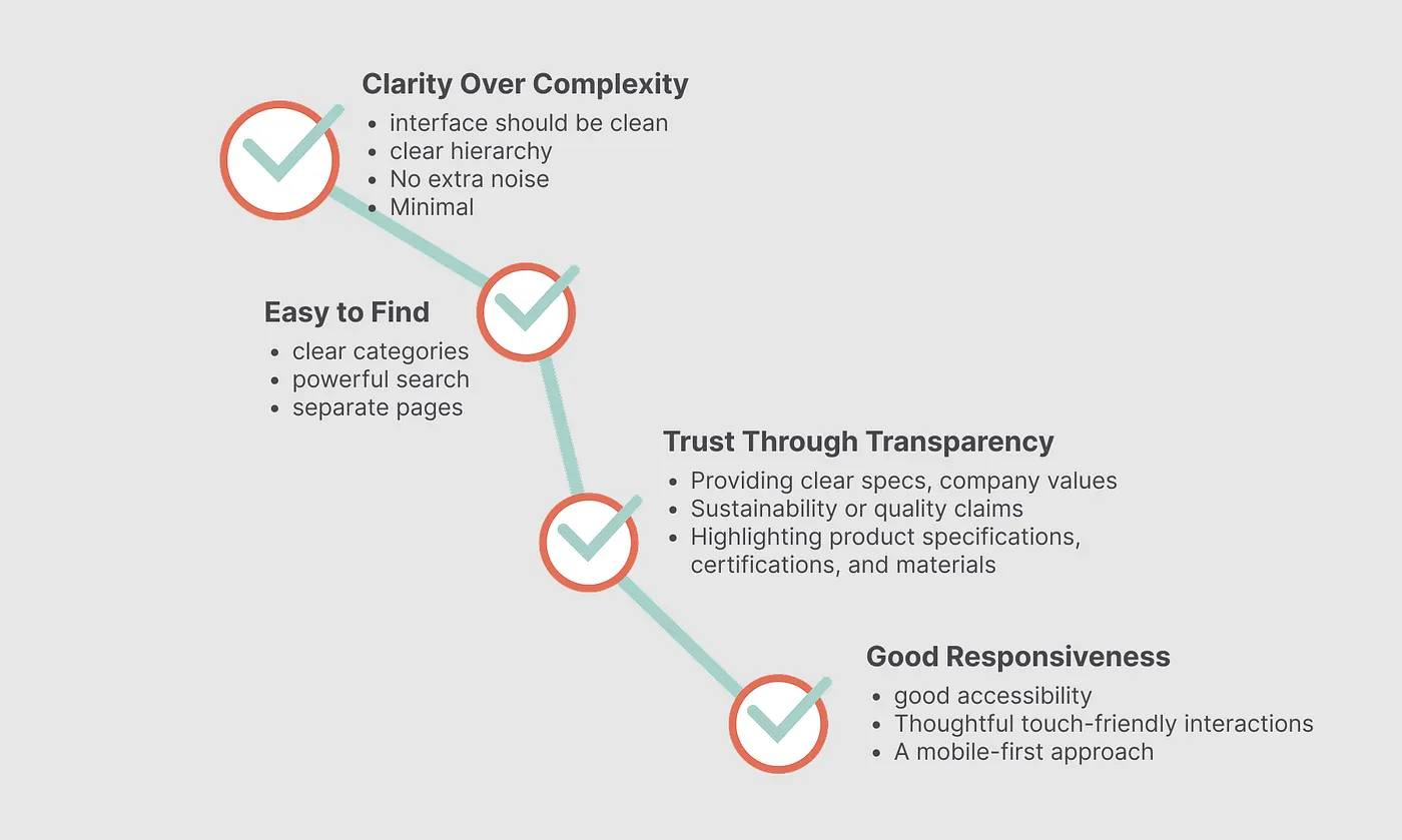
🖋After going through all the observations, checking competitors, and research, it became clear to me: I need to design a clean UI website with strong branding, full-screen product showcases that look great, a good search function, and well-organised categories.
I defined a set of principles to guide my design approach:
3. Ideation
🧠And finally, it was time for my favorite part of the process.
In the ideation phase for SkyGlobal, I created a sitemap and user flow to simplify navigation. The sitemap will outline key sections, and the user flow will map out tasks like booking services. This helped me to improve my design for a better user experience.
Low-fidelity design
Of course, it was time to dive into some sketches and low-fidelity designs for the main page!
4. Prototype
🤪Naturally, the first step in my design process was to create all the buttons, input fields, and foundational rules for the design system I wanted to build upon.
Final Design
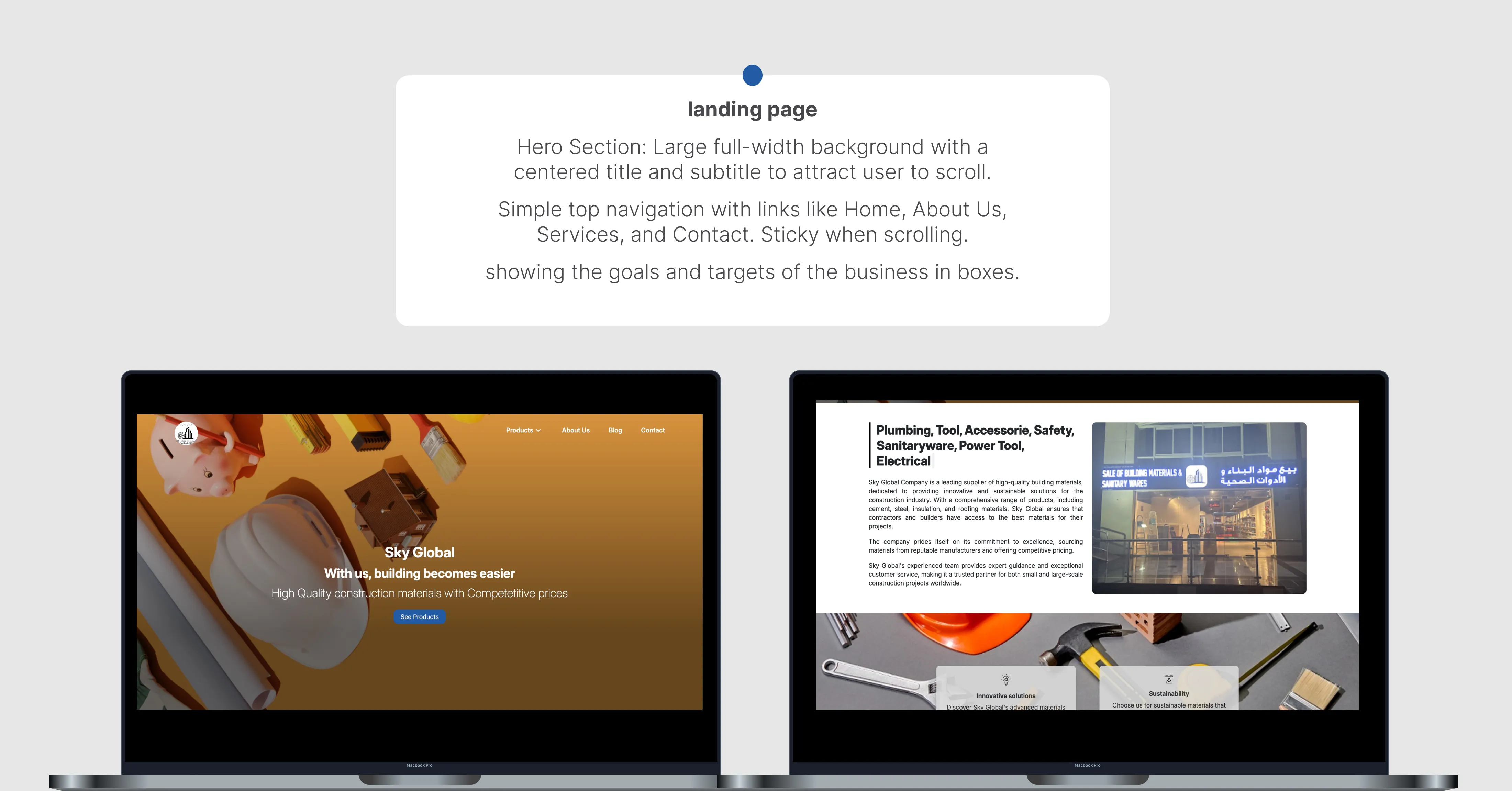
I finalised the designs by refining the layout, enhancing the visual hierarchy, and ensuring a cohesive, responsive experience across all devices.
For the administration dashboard, I crafted all the essential screens, ensuring intuitive navigation and a visually cohesive experience. I focused on making each task clear and user-friendly.
I also focused on optimising the responsive design to ensure a smooth and intuitive user experience across all devices, making sure the layout adapts seamlessly to both mobile and desktop.
4.Test
😓Due to time constraints, we weren’t able to conduct full testing, but after some observations, I gathered a few key insights:
Filtering Products and Use Relevant Images
It’s important to organize products with clear filters and use the right images for each section. This helps users find what they’re looking for faster and makes the experience smoother.Humanizing the Web with People’s Faces
Adding images of people’s faces can increase trust and create a more personal connection. Humanizing the website helps users feel more at ease.Enhancing Accessibility Features
Ensuring the website is accessible to all users, including those with disabilities, is crucial. This includes optimizing text, images, and navigation for a broader audience.Monitoring User Feedback and Analytics
Regularly collecting feedback and analyzing user behavior can provide valuable insights into what’s working and what needs improvement.
Thank you for the attention


